Friday, 1 February 2013

Test Shots

These are my test shots which I taken in my media lesson. The images  I done are a vague idea of how I want my pictures in my contents page to look, the images do not look so professional as the background is not well throughout but this will be an improvement in my final images.

The first image is of my model holding a microphone, I want this to like that she was playing in a concert so she was busy facing down and singing. The idea was from billboard were an artist was pictures during her performance

The second image is just of instruments of drums, I realised this was not really apart of my genre so I may change the instruments around. The reason why I have just the instruments is that I wanted to create mystery of who the band may be.

The last image is of my model working; she is playing with a keyboard and listening through headphones. The idea of this was to get an artist working on his/ her track so it will be an exclusive behind the scene and making of the music. This will draw the reader in more as it will be private and more interesting to read.

Thursday, 31 January 2013

This is the peer assessment which I had to do with another media student were, she analysed my flat plans and said if it was poor average or excellent.

Appropriate material for target audience – Proficient
Understanding on conventions of layout and page designs – Proficient
Awareness of variety in fronts and text size – Excellent
Accurate of language and register – Excellent
Planning of the photo – Excellent

Friday, 25 January 2013

Shot List


This is my shot list which I will be using for my magazine. The shot list helped me have an idea to decide on the timings I will be taking my picture and which parts of my magazine I will be working on first. The shot list contained the location were I will be taking my pictures, what type of location, mise-en-scene and the props which I will be using. This was very beneficial at it saved me time to decide this all later when taking he pictures. It also had the shot type which gave picture of how I want my magazine to look linking to the flat plan. The shot list gave me a clear idea of what type of pictures this is my shot list which I will be using for my magazine. The shot list helped me decide I will be using or trying to us, and if not I will be able to analyse this to in the notes column if there was any problems and what were the successes.

Wednesday, 23 January 2013

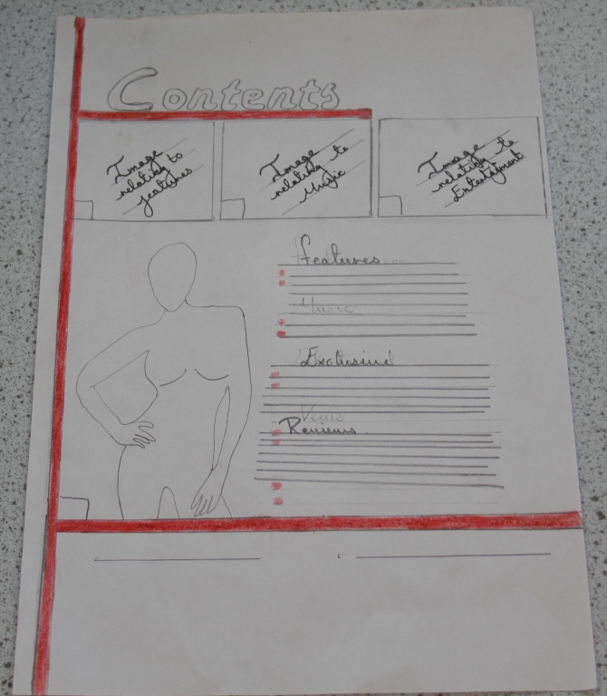
This is my flat plan which I created using the inspiration of different R&B magazines you can see this in the post below. I have created my front cover, contents and double page spread this was then shown to another media student were I got the feed back to pick a colour scheme and to write the directions were text would go and images, even if I can’t think of what I’m going to write.


Front cover
Contents page
Double page spread
Photo shop 1

This is one of the pictures which I photoshoped, I learnt how to add colours to certain parts of the image which I wanted. I had done this by layering the image with the same image and changing the picture to black and white, and then rubbing out the bit where I wanted colour.

These are the ideas and inspiration which I got in creating my flat plan, these R&B magazines helped me choose what conventions I would have in my magazine.
Cover
I have researched front covers of R&B magazines, and these were my most favourable images. Most of the shots on the magazine cover are a close up or a mid shot, this is what I also found out was the most effective in my market research. Also in all of the images they have eye contact this draws the reader in and makes them feel more engaged with the magazine. In my magazine I have decided to have a close up shot of my model lying down or up against a plain wall. The reason for this is because it is a convention in R&B magazines to have a close of a celebrity with added effects such as no background, brightness and contrast. I will also have the heading just over the forehead of the model as my magazine is not well known people would not instantly recognise it if parts are missing like the Christina Billboard magazine.  I will also add in subheadings on the right and left side with the models name in a large text like the magazines bellow. I would also add in a button or some sort of feature to the right top of the page. 
Contents
There were not many R&B Magazines that caught my eyes apart from the billboard magazine it contains more then one image, which is different for vibes magazine, they only consist of one image which has been affected. But personally I feel that billboard has more of a statement which I copied. This was a good affect, which I tried doing similar features just different colour scheme. I will have the 3 images above and also an effective image on the side that goes with the white background. Also I saw that R&B magazines have subheadings above the number of pages, which show different sections that the magazine consists of such as exclusive, featuring and news this makes it easier for the reader to see what section they want to go to which I be doing something similar to. 
Double  
When I done my research for R&B magazines these are the two images that really stood out and for me was the most effective.  All of the images that have been used in the both magazines have been edited. This is a big main convention in R&B magazines. The effects used is to make the image transparent or adjusting the colour. Another convention which I saw was that that there was a teaser on big bold writing that is in different colour to the text, I will also be using this in my magazine. Also pull quotes are used which are usually in a different font size and colour. There could also be a title or the artist name in bold writing, also there needs to be the title of the magazine on the top left corner and who the article was done by.

Photography session
In today’s photography session we were learning about planning, camera shots, and lighting and to focus the camera by using IOS and aperture, this was done by using the Manual button on the Canon camera so that we have full control. We were learning about relating the image to our chosen genre and how we can use different, and that to get the right pictures I should take around 100 pictures to at least get the right 5. This helped me get an idea of how my pictures for the front cover of the magazine should look as in the type of shot I use and to see the proportion of the image and that eye contact is the most effective.
Below you can see the images we took of our photography teacher; these images have not been edited. But after this we were taught how to Photoshop the image, such as brightness and contrast, how to use the rubber tool efficiently and manipulating images so they are black and white or add colour to specific parts of the image by layering the same picture onto another and rubbing out the bits we want in colour. We also learnt how to airbrush using different tools so that the skin looks smooth and has a professional textured look.